

Let’s be honest, choosing the perfect paint color for your home can feel like navigating a minefield blindfolded.
Over the years, my walls have borne witness to a spectrum of hues that ranged from “interesting experiment” to “outright disaster.”
My Colorful Confessions: A Journey Through Paint Fails and Hard-Earned Wisdom
Consider the size and lighting of your room
My first foray into the world of paint was fueled by pure enthusiasm and zero foresight. I spotted a vibrant, almost electric lime green in a magazine and declared, “That’s it!” Ignoring the small size of the swatch and the fact that my living room faces north with limited natural light, I plunged in. The result? A space that felt less like a cozy haven and more like the inside of a fluorescent highlighter. It was energizing in a way that made relaxation utterly impossible.
Lesson learned: Always consider the size and lighting of your room. What looks good on a small swatch under store lights can be overwhelmingly intense on an entire wall.

Undertones Matter
Next came the “sophisticated grey” phase. Determined to create a chic and modern atmosphere, I opted for a cool, charcoal grey. On the swatch, it whispered elegance. On my walls, it shouted “cave!” My south-facing living room, which I thought would handle the depth, absorbed the light and made the space feel smaller and surprisingly gloomy. It sucked the life out of the room.
Lesson learned: Undertones matter. Big time.
That cool grey had a hidden blue undertone that amplified the lack of warmth in the space. Always get samples and paint large swatches on your walls to observe them throughout the day.
The inevitably of Twitter’s end should not be cause for despair—there is excitement in what awaits us on the other side, in what comes next. That, for me, has always been the addictive charm of the social internet: that we continually find new ways to interact, create, be. That no matter what, we never stagnate.
One of the many things inherent in the digital age—and especially on social media, where the tinkering and retooling of relationships is a constant—is the certainty of impermanence, the assurance of the ephemeral. Things are here and then, in a spectacular flash, they are not.
Then there was the “inspired by nature” phase that went terribly wrong. I envisioned a calming, earthy terracotta for my bedroom. What I ended up with was something that resembled the inside of a brick oven.
The warm, reddish tones became overwhelmingly intense in a smaller space, making it feel claustrophobic and even a little…hot. Sleep became a surprisingly energetic affair.
Lesson learned: Scale down intensity in smaller rooms.
My journey wasn’t all doom and gloom, though. Each mistake, while initially frustrating, nudged me closer to understanding the nuances of color. After the terracotta incident, I finally wised up and embraced the power of samples. I lived with those painted squares for days, observing how the light transformed them from dawn till dusk.
It was during this patient observation that I discovered the magic of “warm neutrals.” Initially, I’d dismissed them as boring, but a soft, creamy white with warm undertones finally brought a sense of light and spaciousness to my living room. It became the perfect backdrop for my colorful furniture and artwork, allowing them to truly shine.
Lesson learned: Neutrals are not the enemy.
They can be incredibly versatile and create a wonderful foundation. Also, Don’t be afraid to experiment with muted versions of your favorite colors. They can offer the desired mood without the intensity.
Choosing the right paint color is a deeply personal journey, and a few missteps along the way are almost inevitable.Ultimately, the best colors for your home are those that make you feel good. Consider your personal preferences, the function of each room, and the atmosphere you want to create. By understanding the psychology of color, you can move beyond simply choosing what looks appealing and intentionally design a home that nurtures your well-being, one brushstroke at a time.
World of Hues
Let’s delve into the fascinating world of hues and how they can transform your space and your state of mind:
Blue: The Serene Sanctuary
Blue naturally evokes feelings of calmness, peace, and stability. Lighter shades of blue can create an airy and spacious feel, making them ideal for bedrooms where restful sleep is the goal. Deeper blues can inspire trust and dependability, working well in home offices or studies. However, be mindful of overly dark blues, which can sometimes lean towards melancholy.
Yellow: The Spark of Joy
Yellow is a cheerful and energetic color that can boost your mood and inspire creativity. It’s a fantastic choice for kitchens and dining areas, fostering a sense of warmth and welcome. In home offices, a touch of yellow can stimulate focus and innovation. However, bright, intense yellows can be overwhelming in large doses, so consider softer, more muted tones or using it as an accent.
Green: The Harmony of Nature
Bringing the outdoors in, green is synonymous with nature, growth, and balance. It’s a refreshing and restorative color that can promote feelings of tranquility and well-being. Living rooms often benefit from the grounding influence of green, creating a harmonious space for relaxation and connection.
Red: The Bold Statement of Passion
Red is a powerful color that ignites passion, excitement, and energy. It’s a fantastic choice for making a bold statement, perhaps on an accent wall in a living room or dining area, adding a touch of drama and vibrancy. However, due to its intensity, use red judiciously, especially in bedrooms or spaces where you seek calmness.
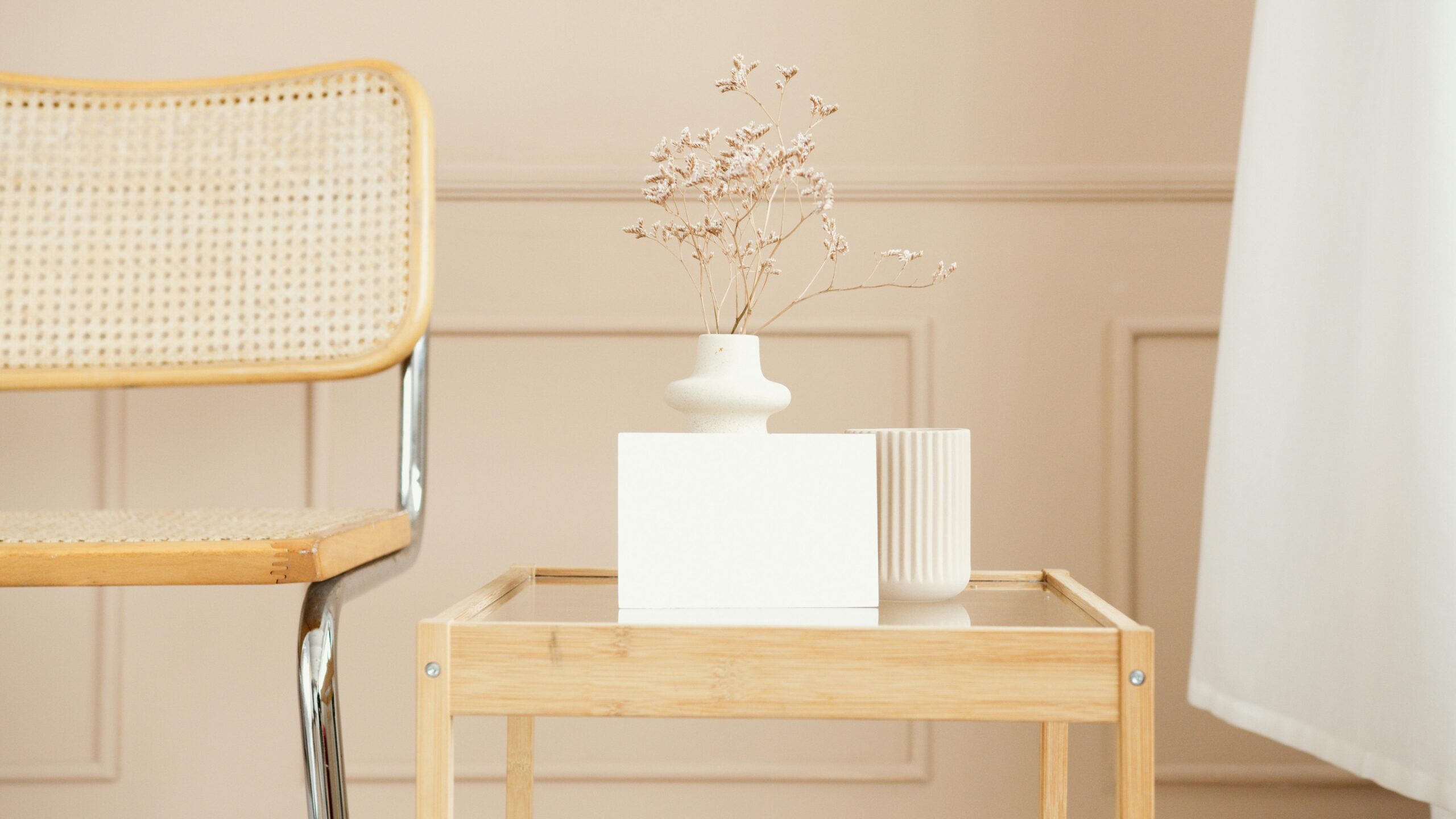
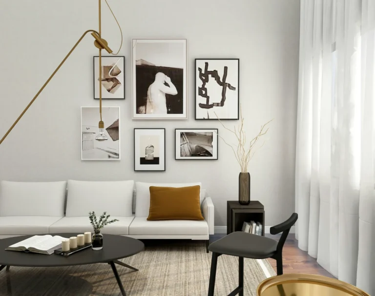
Neutrals: The Foundation of Flexibility
Whites, grays, and beiges provide a versatile and often calming backdrop. They allow your furniture and décor to take center stage and can create a sense of spaciousness and sophistication.
However, to avoid a sterile or bland feel, layer different textures and introduce pops of color through artwork, textiles, and accessories. Warm neutrals can feel cozy, while cool grays offer a more modern vibe.


Beyond the Hue: Understanding Undertones and Lighting
It’s not just about the main color; the undertones play a crucial role. Undertones in paint are the subtle, underlying hues that are mixed into the main color. You might not consciously notice them at first glance, but they play a crucial role in how a paint color truly looks and feels once it’s on your walls. They are the reason why two seemingly similar shades of, say, gray or beige can evoke entirely different atmospheres in a room. A blue with a hint of green will feel different than a blue with a touch of gray.
Similarly, the way natural and artificial light interacts with your chosen paint color can dramatically alter its appearance and the feeling it evokes. Always test paint swatches in your actual space under various lighting conditions before committing to a full paint job.